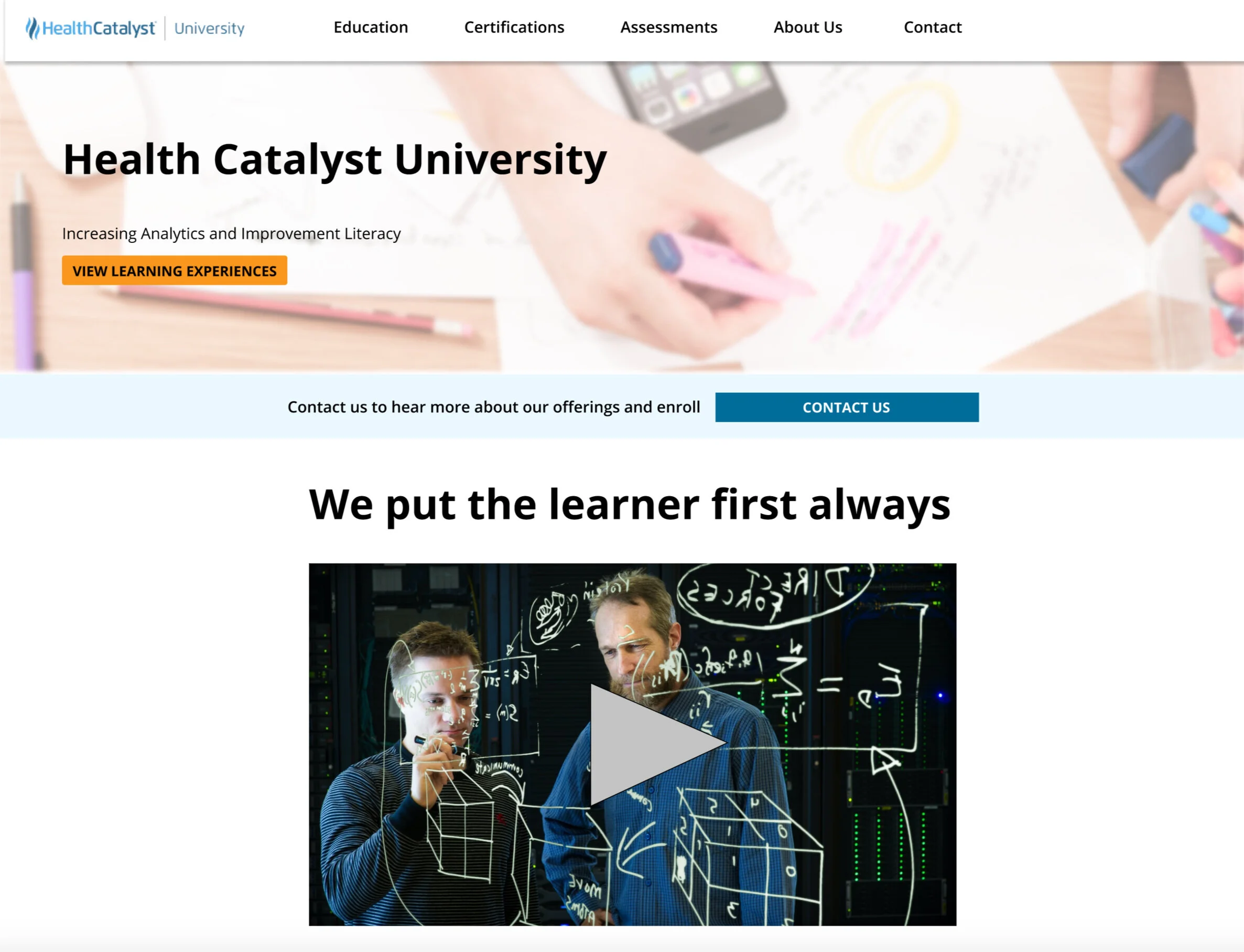
Health Catalyst University Website
Setting
This case study took place during my internship at Health Catalyst. I worked as a learning experience designer to help create learning experiences for our clients and internal team members. Usually, this involved working on the actual training materials or speaking to learners. However, since we were beginning to expand our learning experiences to outside consumer's we needed to update our website and marketing. This project was a unique experience that allowed me to work on our learning experiences' marketing and communication.
My manager approached me about redesigning our web presence for internal and external stakeholders. We had multiple sites storing the same information and various users who had very different needs. The webpages became unruly to update, and it became complicated to find and convey accurate information. I was excited to take on the project and organize our websites to get exact information to our users.
Defining the Problem
Before I went about redesigning the website, I wanted to understand the problem space. I started by talking to my team and internal stakeholders about what the problem was. I worked to understand what we hoped to accomplish with our web presence.
The three different sites storing our information.
Multiple Paths Leading to Multiple Outcomes
One of the challenges of our website was that there were multiple different sites housing our information:
An intranet site housing info for internal team members
A client site where clients and internal team members could receive information
And the public website where external people and anyone could learn about our offerings
The multiple sites worked for Health Catalyst's other teams, but it wasn't serving our group very well. Sometimes things needed to be shared internally; other times, we needed to provide access to our clients' materials and documentation. Having many websites resulted in a mess of sites housing different information.
Untangling the web
A site map of our public site I used to help organize where our content was stored.
I talked to my team members about what goes on each site and what we needed to convey to internal team members, clients, and the general public. I went through each site and mapped out the current content to understand the current organization and its overlap.
Internal team members needed information on our current offerings and internal training documents. These could remain on our intranet site. However, I suggested using the public site to house information about our client training offerings.
The client portal was in between public and private. In the past, we stored information on offerings here. I suggested that we move this content to the public site.
The public site conveyed some simple information about our offerings, but the content was outdated and not reflective of our offerings.
It became clear after looking at this that there needed to be a single source of truth for our offerings.
I decided the best place to direct effort was to redesign the public website. By focusing on one area, we could use our limited resources effectively.
Ideating
Before jumping into a solution, I decided to research what other competitor sites had done in the past. I looked at similar professional education sites and how they organized their offerings and content.
A Miro board showing other professional sites that I looked to for inspiration.
How to organize?
I then had to decide how to organize the information we wanted to convey. There were several ways to manage the offerings. Some of our experiences were bundled together, some were part of specific learning experiences, and others were assessments and not courses.
I brainstormed and worked with my team to discover the best organization. In the end, I decided that the most logical way to organize the site hierarchy was by creating sections for education, certification, assessments, about us, and contact.
Organization I decided on using for the site mockup.
Prototyping
I then created a low-fidelity mockup of the website in Miro. I wanted the site to have an attractive front page that led people to contact our sales team. I also made the mockup be upfront with a clear value proposition.
The prototype went over well with my teammates. However, we were reorganizing our offerings and services. Therefore I had to wait until we solidified our value proposition before moving on to further iterations.
After we solidified our offerings, I decided to revisit our website. With our new offerings, I had to restructure the organization of the site.
The team loved the new design and thought it was better than any previous web presence we had. We then needed to add the copy that talked about our products.
Unfortunately, my internship ended before we could add the final copy to the site design. Even though I did not get to implement the completed site, I was happy to have left my team with a blueprint to guide their future work. I will be checking back to see what the final implementation looks like!
You can view and interact with my latest prototype below. Feel free to explore!


